Chapter 3 Methods for Disease Module Identification and Disease Similarity
In this chapter, I will introduce the main methods used in Network Medicine. We will start by understanding what a Disease Module is (Session 3.1), how we can calculate its significance, and also understand its importance. Next, we will explore the disease separation (Session 3.3), how to calculate, and make interpretations.
3.1 Disease Module
In biological networks, genes are often involved in the same topological communities are also associated with similar biological processes (Ahn, Bagrow, and Lehmann 2010). It also reflects on how diseases localized themselves in the interaction; meaning that, disease modules are highly localized in specific network neighborhoods (Menche et al. 2015) (Figure 3.1).
3.1.1 Largest connected component
The size of the largest connected component (LCC) is the number of nodes that form a connected subgraph (in our case, it is the number of proteins that are interconnected in the PPI). Many properties of this quantity allow us to understand how a particular disease interacts with the interactome. It is important to note here that this measure is highly dependent on the completeness of an interactome. If a link between a protein and its counterparts is unknown – therefore missing – we might say that that particular node is not involved in a disease module (or that the LCC is not significant).
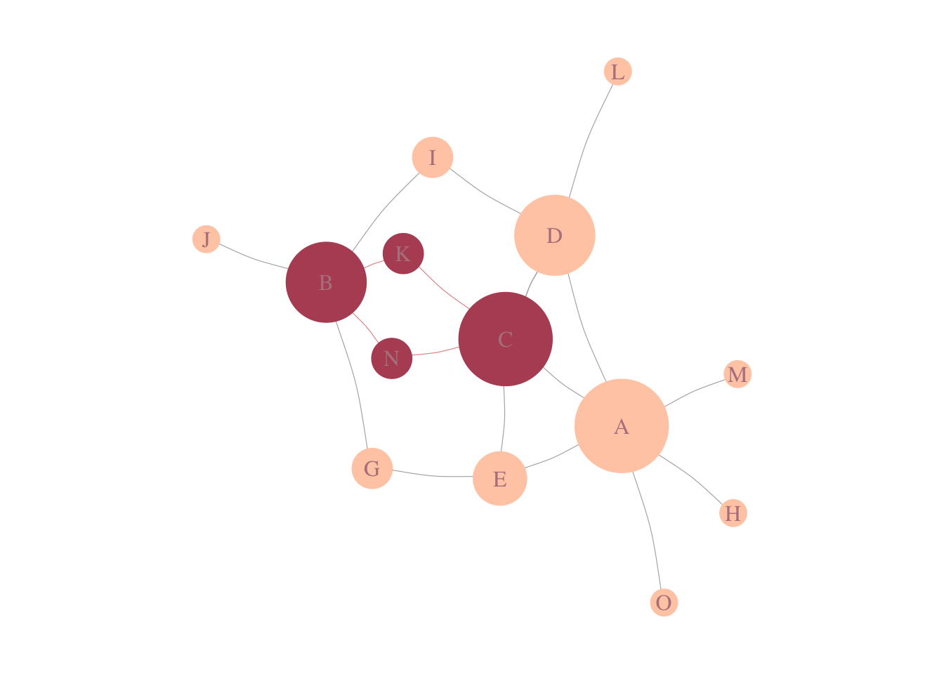
Figure 3.1: Disease-Module. In a schematic of a PPI, in pink, we see genes associated with a disease, forming a connected component of size 4.
However, just computing this number might not be informative, and it is expected a randomness. To calculate this randomness, we often calculate the significance of the LCC by selecting proteins in the interactome with similar degrees (aka degree preserving randomization).
To calculate the significance of the LCC, one can calculate its Z-Score or simply calculate the empirical probability under the curve from the empirical distribution. The Z-score is given by:
\[ Z-Score_{LCC} = \frac{LCC - \mu_{LCC}}{\sigma_{LCC}}. \]
3.1.2 Example in real data
Our first task now is to understand if some diseases, from our Cleaned_GDA are able to form a Disease-Module. Let’s start doing it for Schizophrenia and later we will add some more diseases.
The idea now is: Gather the genes associated to our disease in the data, find them in the PPI, check if they form a connected component, check the significance of the component and visualize the Disease-Module.
# First, let's attach all packages we will need.
require(NetSci)
require(magrittr)
require(dplyr)
require(igraph)
#First, let's select genes that are associated with Schizophrenia.
SCZ_Genes =
Cleaned_GDA %>%
filter(diseaseName %in% 'schizophrenia') %>%
pull(geneSymbol) %>%
unique()
# Next, let's see how they are localized in the PPI.
# Fist, we have to make sure all genes are in the PPI.
# Later, we calculate the LCC.
# And lastly, let's visualize it.
SCZ_PPI = SCZ_Genes[SCZ_Genes %in% V(gPPI)$name]
gScz = gPPI %>%
induced.subgraph(., SCZ_PPI)
components(gScz)components(gScz)$csize %>% max## [1] 683# The size of the LCC is 683. But... How does it compare to a random selection genes?
LCC_scz = LCC_Significance(N = 1000, Targets = SCZ_PPI,
G = gPPI)
Histogram_LCC(LCC_scz)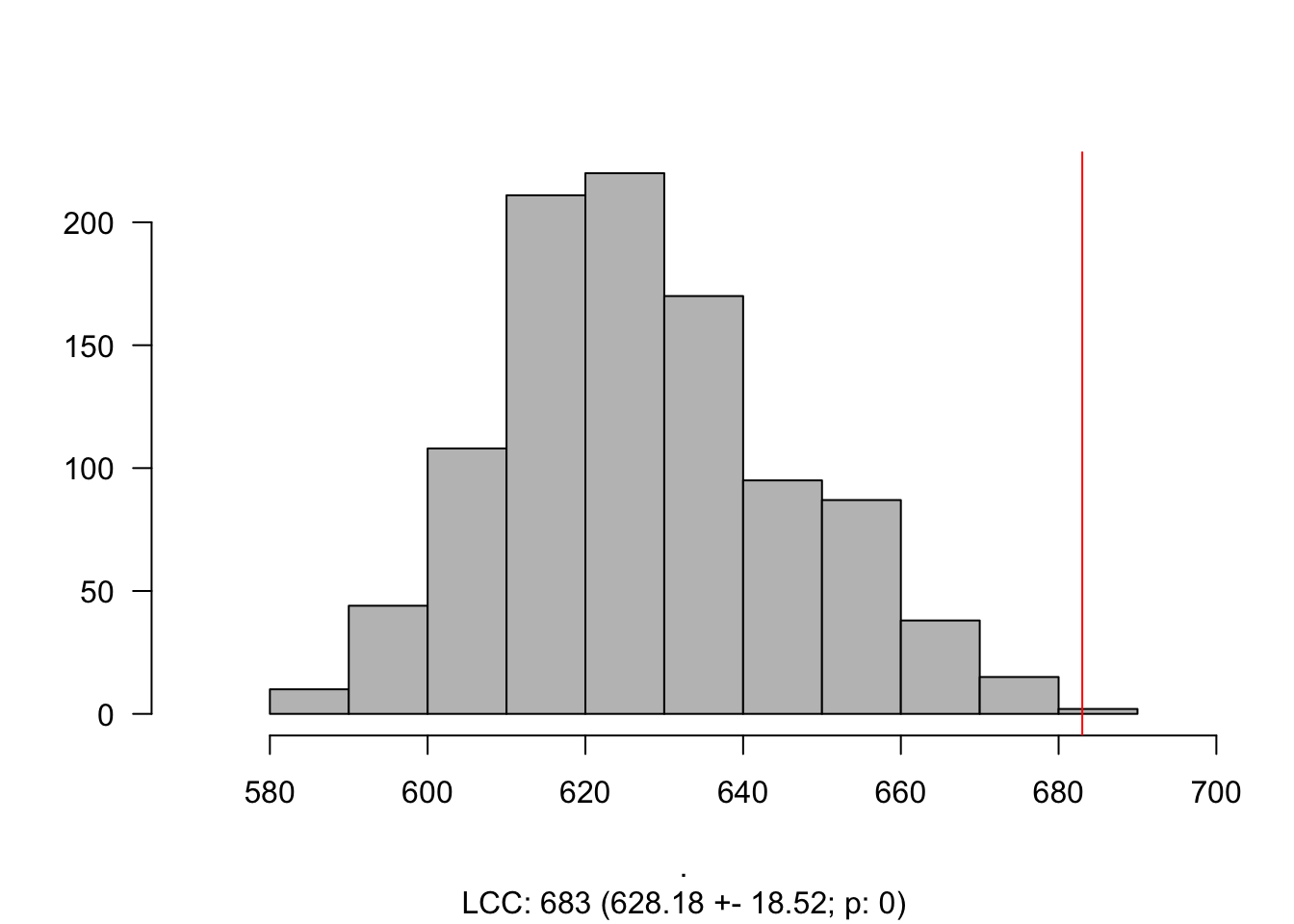
gScz ## IGRAPH ac014bc UN-- 846 2564 --
## + attr: name (v/c)
## + edges from ac014bc (vertex names):
## [1] PI4KA --SP1 F2 --SP1 DNM1 --CTCF GSK3B --HSPA1A
## [5] DNM1 --GRB2 SP1 --GRB2 MET --GRB2 GSK3B --MAPK14
## [9] SP1 --MAPK14 CTCF --MAPK14 GRB2 --MAPK14 MET --ACTB
## [13] GRB2 --ACTB MAPK14 --ACTB GSK3B --SOX10 SP1 --SOX10
## [17] PAX6 --SOX10 SP1 --CCNA2 ACTB --MTNR1A ACTB --GSN
## [21] PI4KA --JUN GSK3B --JUN SMARCA2--JUN SP1 --JUN
## [25] MAPK14 --JUN SOX10 --JUN GSK3B --ESR1 SMARCA2--ESR1
## [29] SP1 --ESR1 HSPA1A --ESR1 FMR1 --ESR1 MAPK14 --ESR1
## + ... omitted several edgesV(gScz)$size = degree(gScz) %>%
CoDiNA::normalize()
V(gScz)$size = (V(gScz)$size + 0.1)*5
V(gScz)$color = '#83c5be'
V(gScz)$frame.color = '#006d77'
V(gScz)$label = ifelse(V(gScz)$size > 4, V(gScz)$name, NA )
V(gScz)$label.color = '#e29578'
E(gScz)$width = edge.betweenness(gScz, directed = F) %>% CoDiNA::normalize()
E(gScz)$width = E(gScz)$width + 0.01
E(gScz)$weight = E(gScz)$width
par(mar = c(0,0,0,0))
plot(gScz)
gScz %<>% delete.vertices(., degree(.) == 0)
V(gScz)$size = degree(gScz) %>%
  CoDiNA::normalize()
V(gScz)$size = (V(gScz)$size + 0.1)*5
V(gScz)$color = '#83c5be'
V(gScz)$frame.color = '#006d77'
V(gScz)$label = ifelse(V(gScz)$size  > 4, V(gScz)$name, NA )
V(gScz)$label.color = '#e29578'

E(gScz)$width = edge.betweenness(gScz, directed = F) %>% CoDiNA::normalize()
E(gScz)$width = E(gScz)$width + 0.01
E(gScz)$weight = E(gScz)$width
par(mar = c(0,0,0,0))
plot(gScz)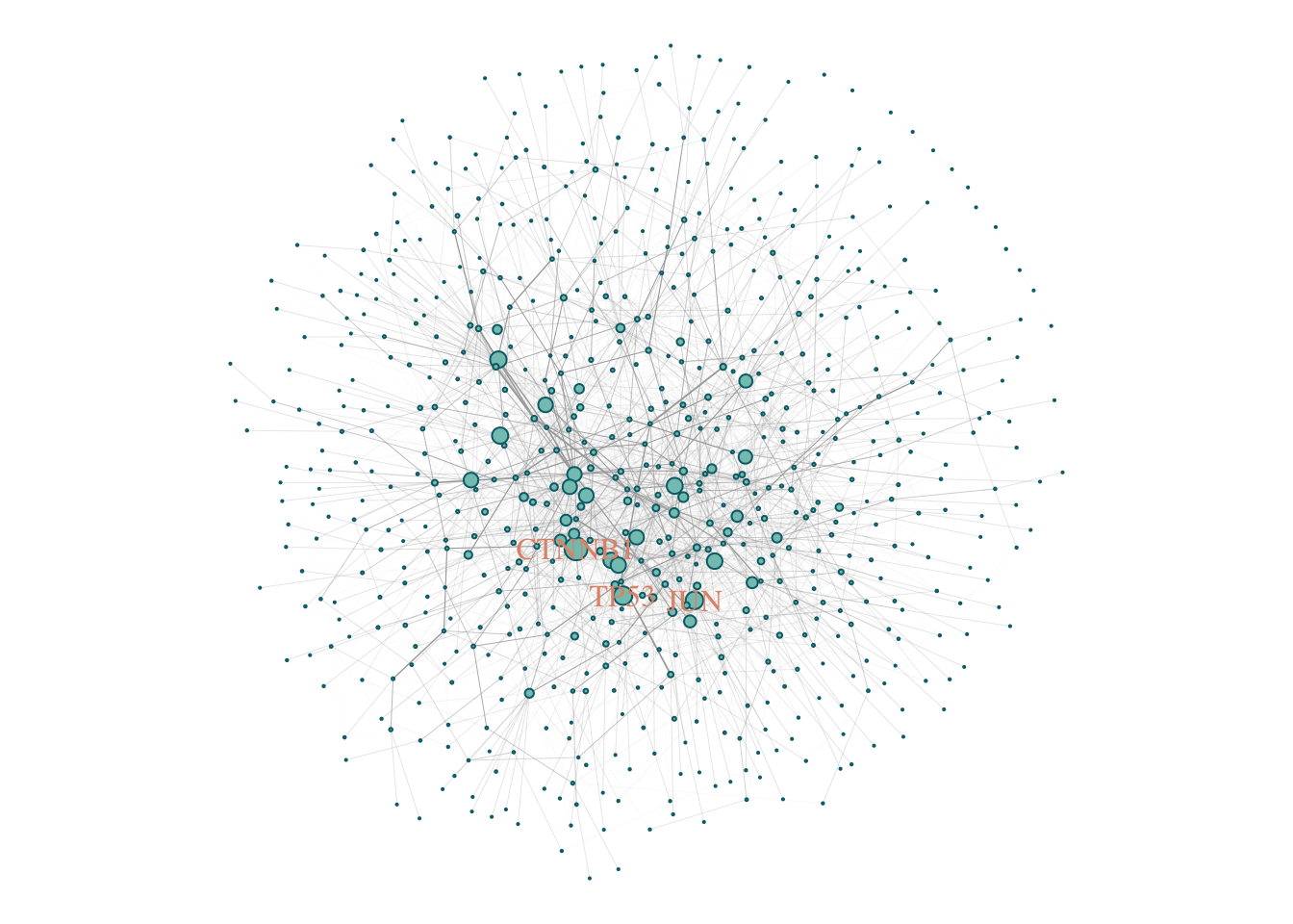
3.1.3 Exercises
Calculate the LCC, and visualize the modules for the following diseases:
- Autistic Disorder;
- Obesity;
- Hyperlipidemia;
- Rheumatoid Arthritis.
Choose any disease of your interest and do the same thing.
3.2 Gene Overlap
A first intuitive way to measure the overlap of two gene sets is by calculating its overlap, or its normalized overlap, the Jaccard Index. The Jaccard index is calculated by taking the ratio of Intersection of two sets over the Union of those sets. The Jaccard coefficient measures similarity between finite sample sets, and is defined as the size of the intersection divided by the size of the union of the sample sets:
\[ J(A,B) = \frac{|A \cap B|}{|A \cup B|} = \frac{|A \cap B|}{|A| + |B| - |A \cap B|}. \]
Note that by design, \(0 \leq J(A,B) \leq 1\). If A and B are both empty, define \(J(A,B) = 1\).
Let’s calculate the Jaccard Index for the five diseases we calculated its LCCs.
Dis_Ex1 = c('schizophrenia',
            "autistic disorder",
            'obesity',
            'hyperlipidemia',
            'rheumatoid arthritis')
GDA_Interest = Cleaned_GDA %>%
  filter(diseaseName %in% Dis_Ex1) %>%
  select(diseaseName, geneSymbol) %>%
  unique()

Jaccard_Ex2 = Jaccard(GDA_Interest)
##
|
| | 0%
|
|============== | 20%
|
|============================ | 40%
|
|========================================== | 60%
|
|======================================================== | 80%
|
|======================================================================| 100%Jaccard_Ex2## Node.1 Node.2 Jaccard.Index
## 1: schizophrenia autistic disorder 0.095785441
## 2: schizophrenia obesity 0.039159503
## 3: autistic disorder obesity 0.033259424
## 4: schizophrenia rheumatoid arthritis 0.027210884
## 5: autistic disorder rheumatoid arthritis 0.035714286
## 6: obesity rheumatoid arthritis 0.029891304
## 7: schizophrenia hyperlipidemia 0.005586592
## 8: autistic disorder hyperlipidemia 0.007246377
## 9: obesity hyperlipidemia 0.052132701
## 10: rheumatoid arthritis hyperlipidemia 0.000000000# Let's visualize the Venn diagram (Euler Diagram) of those overlaps.
require(eulerr)## Loading required package: eulerrEuler_List = list (
SCZ = GDA_Interest$geneSymbol[GDA_Interest$diseaseName == 'schizophrenia'],
ASD = GDA_Interest$geneSymbol[GDA_Interest$diseaseName == 'autistic disorder'],
OB = GDA_Interest$geneSymbol[GDA_Interest$diseaseName == 'obesity'],
HD = GDA_Interest$geneSymbol[GDA_Interest$diseaseName == 'hyperlipidemia'],
RA = GDA_Interest$geneSymbol[GDA_Interest$diseaseName == 'rheumatoid arthritis'])
EULER = euler(Euler_List)
plot(EULER, quantities = TRUE)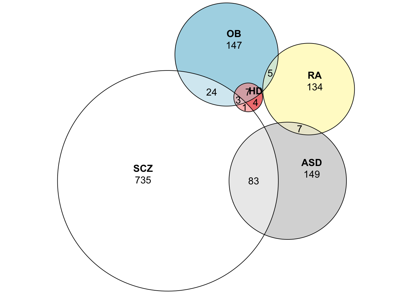
3.3 Disease Separation
When looking into the Jaccard Index, we have a sense of how similar two diseases are based on genes that are known to be associated with both diseases. The main problem with this is that we assume that all genes associated with a disease is known, and we do not take the topology of the underlying network into account.
The separation is a complementary quantity that is a bit less sensitive to the incompleteness of the PPI, we can measure the distances \(d_s\) of each disease-associated node to all other disease associated nodes. Taking into account only the shortest distance between them results in a distribution \(P(d_s)\). The mean value \(<d_s>\) can be interpreted as the diameter of the disease model. Note the diameter here is the average distance instead of the maximal distance.
The concept of network localization can be further generalized to examine the relationship between any different sets of nodes, for example, proteins associated with two different diseases. The network serves as a map, where diseases are represented by different neighborhoods. How close and the degree of overlap of two network neighborhoods can be found to be highly predictive of the pathological similarity of those diseases (Menche et al. 2015) (Figure 3.2).
To quantify the distance of two sets of nodes A and B, we first compute the distribution \(P(d_{AB})\) of all shortest distances \(d_{AB}\) between nodes A and B and the respective mean distance \(<d_{AB}>\).
The network based separation \(S_{AB}\) can be obtained by comparing the mean shortest distance within the respective node sets and the mean shortest distance between them.
\[ S_{AB} = <d_{AB}> - \frac{<d_{AA}> + <d_BB>}{2}. \]
Note: negative \(S_{AB}\) indicates topological overlap of the two node sets, while a positive \(S_{AB}\) indicates a topological separation of the two node sets.
The size of the overlap is highly predictive of pathological and functional similarity, elevated co-expression, symptoms similarity, and high comorbidity diseases.
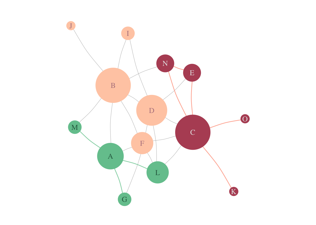
Figure 3.2: Disease-Separation. In a schematic PPI, we see genes associated with a disease A (in pink), and genes associated to disease B (in green).
The separation of diseases A and B is given by: \[ <d_{AA}> = 1.5 \]
\[ <d_{BB}> = 1.5 \]
\[ <d_{AB}> = 2.7 \] \[ S_{AB} = 2.7 - \frac{1.5+ 1.5}2 = 1.2. \]
3.3.1 Example in real data
sab = separation(gPPI, GDA_Interest)##
|
| | 0%
|
|============== | 20%
|
|============================ | 40%
|
|========================================== | 60%
|
|======================================================== | 80%
|
|======================================================================| 100%## Calculating S_ab..##
|
| | 0%
|
|============== | 20%
|
|============================ | 40%
|
|========================================== | 60%
|
|======================================================== | 80%
|
|======================================================================| 100%## Done..Sep_ex2 = sab$Sab %>% as.matrix()
Sep_ex2[lower.tri(Sep_ex2)] = t(Sep_ex2)[lower.tri(Sep_ex2)]We can visualize the network separation of the diseases using a heatmap.
Sep_ex2 %>% heatmap(., symm = T)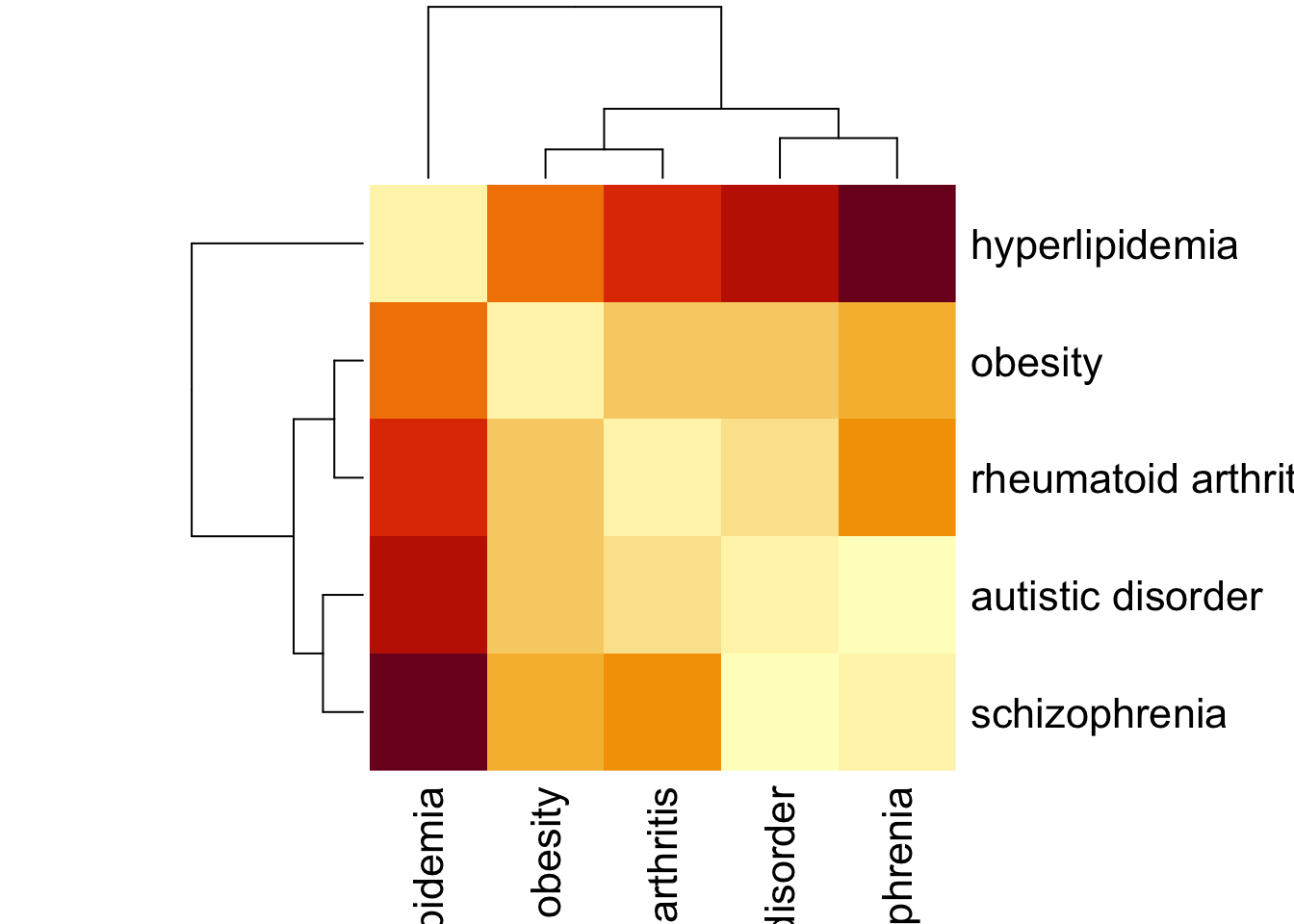
3.4 Exercises
If we go back to our PPI, can we identify that the modules are indeed close or separated? Plot the network for those diseases.
Calculate the Jaccard Index and the Separation for the following diseases:
- Schizophrenia, Bipolar Disorder, Intellectual Disability, Depressive disorder, Autistic Disorder, Unipolar Depression, Mental Depression, Major Depressive Disorder, Mood Disorders, Cocaine Dependence, Cocaine Abuse, Cocaine-Related Disorders, Substance abuse problem, Drug abuse, Drug Dependence, Drug habituation, Drug Use Disorders, Substance-Related Disorders, Psychotic Disorders, Obesity, hyperlipidemia, Rheumatoid Arthritis, Prostatic Neoplasms, Mammary Neoplasms, Mammary Neoplasms, Human Malignant neoplasm of stomach, Stomach Neoplasms, Colorectal Neoplasms, Malignant neoplasm of lung, Lung Neoplasms, Malignant neoplasm of prostate.
Optional: Try to make the network visualization for the heatmap of
Sep_ex2. Use diseases as nodes, and their weight as links.Optional: Plot the PPI with genes selected in
GDA_Interest, where each node is a piechart representing which diseases are associated with that particular gene. Tip: Checkvertex.shape.piefor help.